ADMA Logo

Life, land, legacy

industry:
Real Estate
Location:
Israel
Collaborators:
Jenna Romano
Sagi Carmi
Ido Hartmann
Naomie Rubner
Construction site with partially built concrete structure and yellow cranes under clear blue sky, with a large billboard in front advertising a boutique community named ADMATAN.

We worked on

Brand Strategy & Positioning
Brand Naming
Visual Identity
Verbal Identity

Discover

When we sat down with the Adma team to work on their Brand Strategy, it was instantly clear to us that they were not just real estate developers.

They were strategic partners who saw the Israeli market through a different lens. Think: Manhattan precision meets Start Up Nation energy, blending international standards with local instincts. Their company’s mission is all about bridging places and people, finding new projects and partnerships that add value to communities and elevate the quality of life. 

Discover

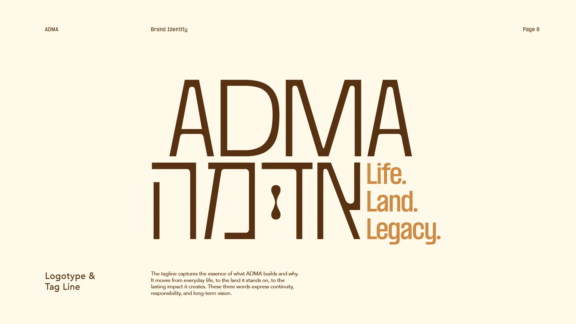
“The name was designed to hold weight in both English and Hebrew, working visually and verbally across cultures without losing clarity or authority.”

Behind the name

We came up with the name, Adma - derived from adamah, the Hebrew word for “earth” or “soil.” It’s short, striking, and substantial, with a grounded strength that feels both elemental and refined. The name has a presence — it sounds like it belongs on the side of a building, on a real estate investment firm, on something built to last. It’s clean and modern, fully accessible in English, and carries just enough depth to spark interest without feeling niche or religious.

Behind the tagline

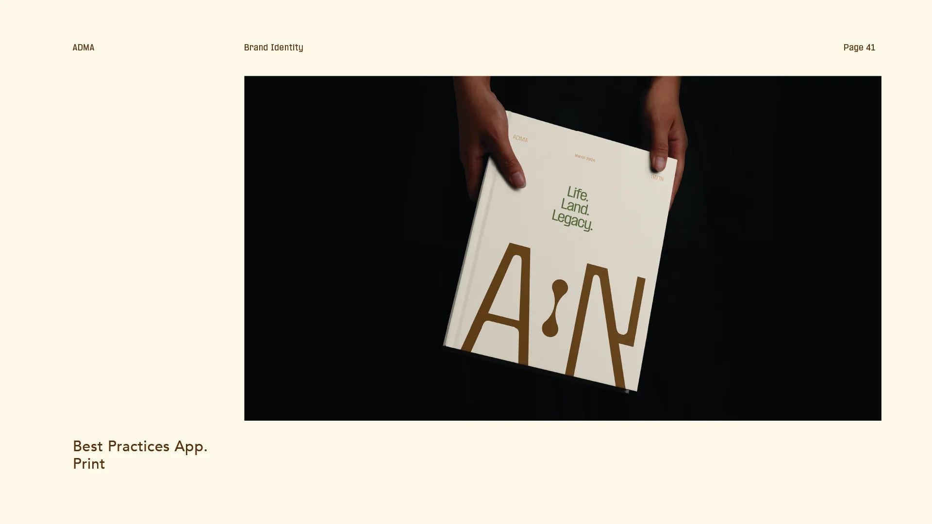
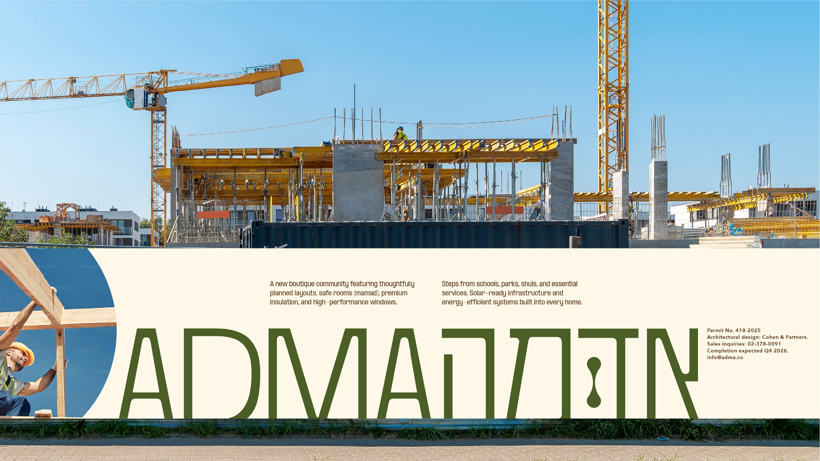
Life, land, legacy. This tagline conveys scale, weight, and longevity. It positions the company as one that develops buildings while creating environments where full lives unfold. It represents real estate projects that are anchored in meaningful places, with an eye toward generational impact. It suggests permanence, intention, and vision.The alliteration of the tagline gives it a polished, corporate feel, while the sequence moves naturally from present to future.

Verbal Identity

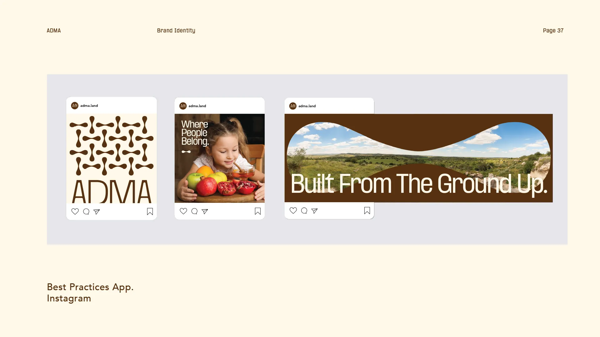
Next, we went on to develop a strong Verbal Identity for the brand

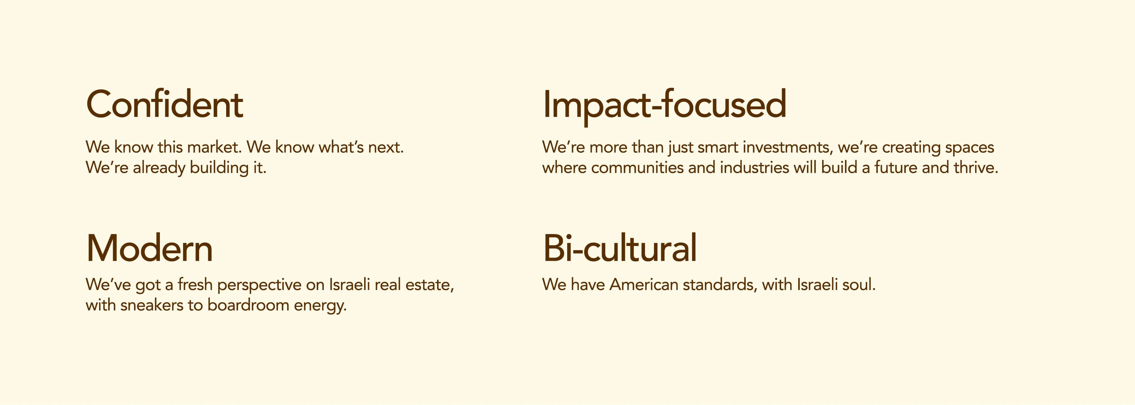
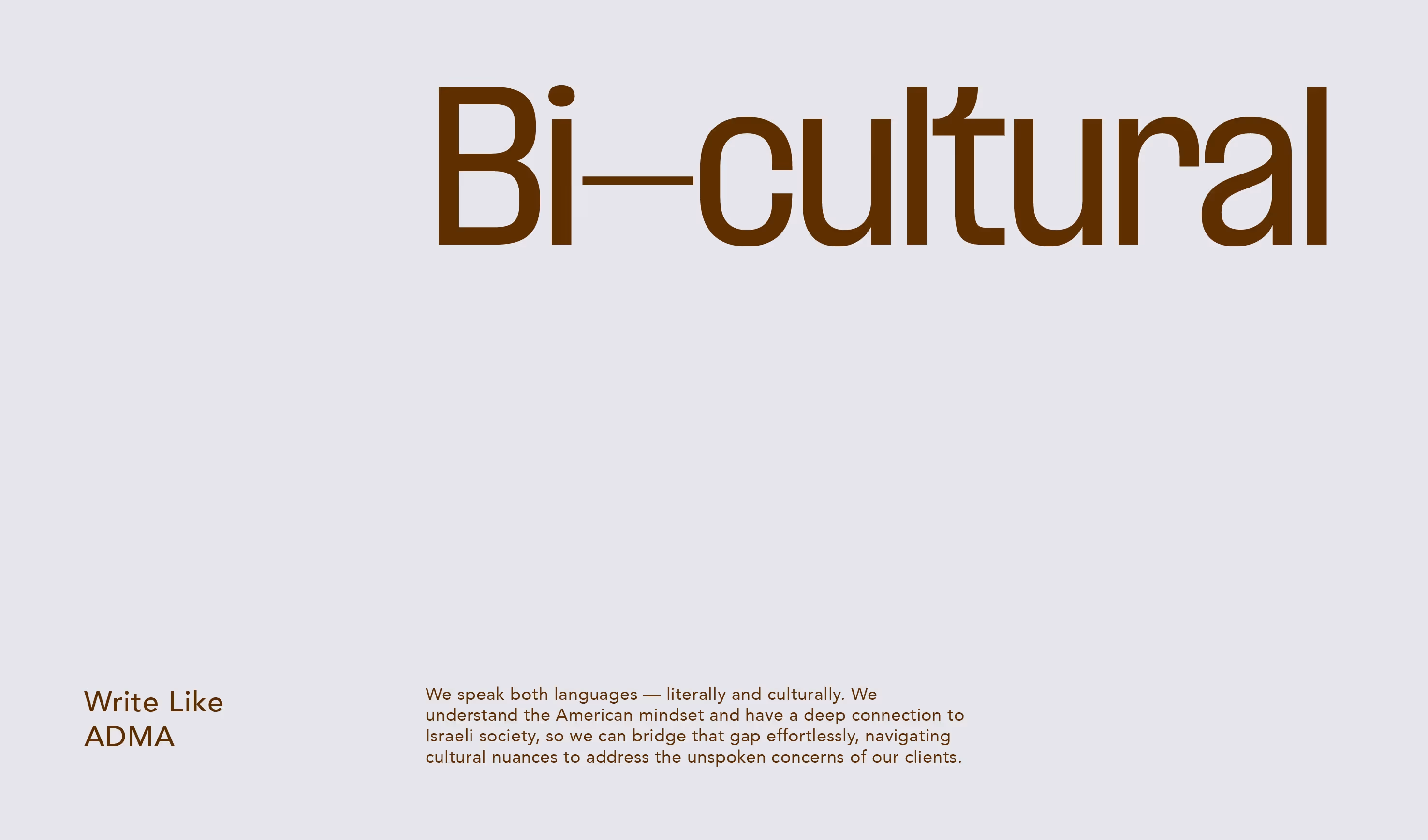
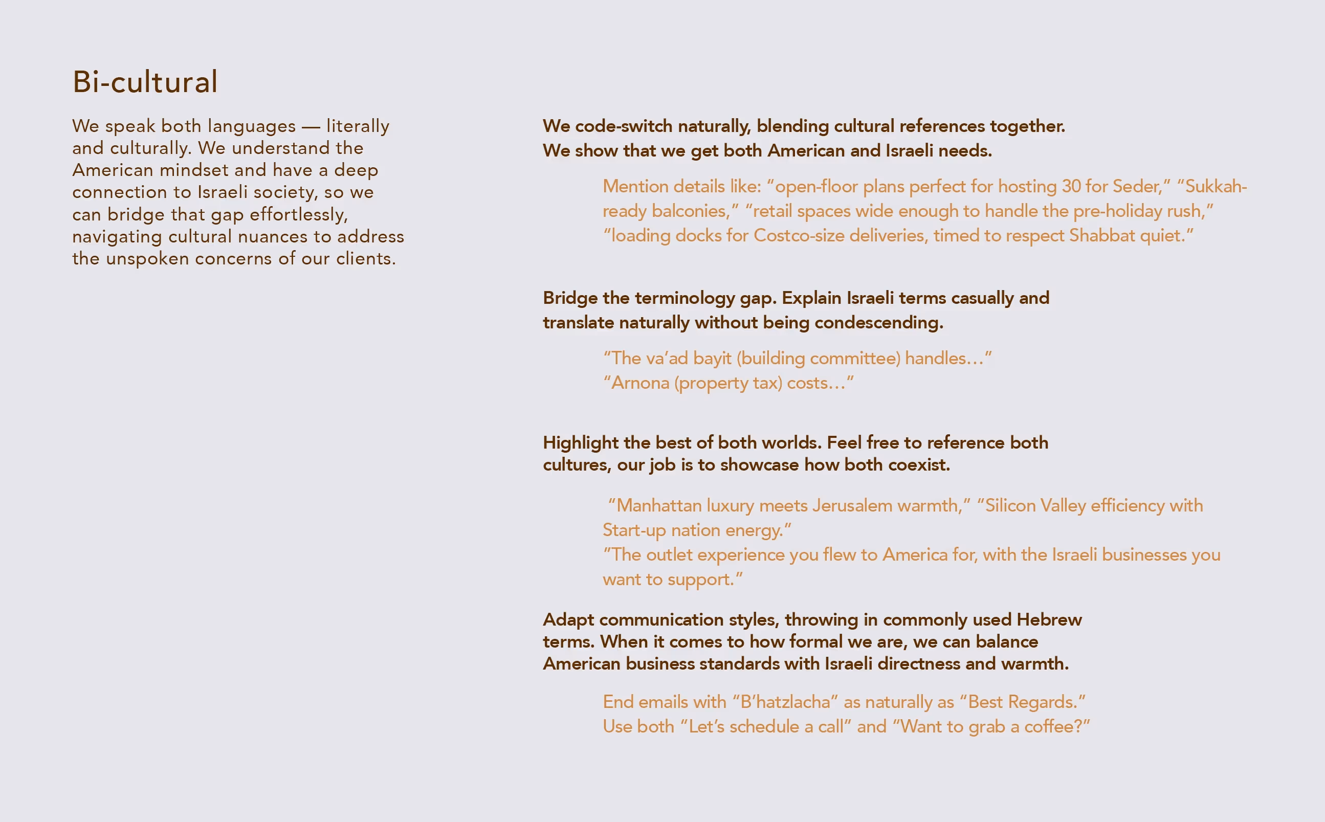
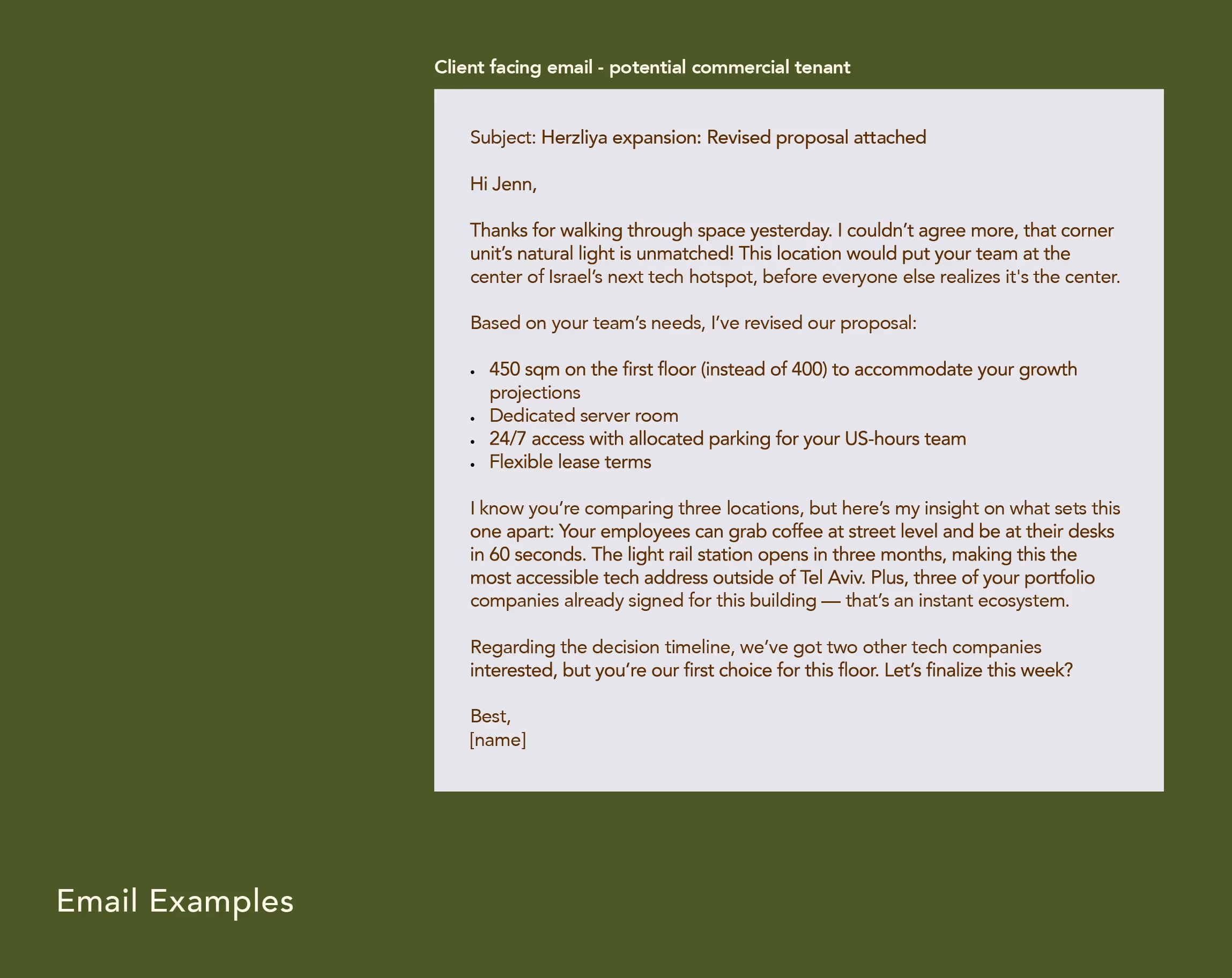
We came up with a tone of voice that would be sharp, discerning, and speak with confidence that comes from seasoned expertise. Adma’s tone of voice needed to reflect that it's a company who sees the Israeli market differently — using fresh perspectives,  spotting undervalued corners, and discovering tomorrow’s prime neighborhoods before they’re obvious. Sophisticated but never stuffy, Adma’s tone of voice combines market intelligence with genuine community vision. 

Design

With the Brand Strategy and Verbal Identity in place, we moved on to the Visual Identity.

The inspiration for the brand was concepts of earth and spirit — organic modernism, deep textures, muted earth tones, sunlight, and human touch. We wanted the visuals to evoke belonging, integrity, and soulful calm.

Design

Colour Palette

Deep earth brown and stone white form the core of the Adma color system. They establish warmth, stability, and clarity across all applications. These colors should dominate most brand expressions and provide a consistent, grounded foundation for the identity.

Logo

The logotype is the core expression of the Adma brand. Its form is confident, contemporary, and restrained, balancing strength with warmth. This is the mark that anchors the entire visual system.

The letterforms are built on clear proportions and consistent rhythm. Tall shapes create a sense of growth and aspiration. Soft curves prevent rigidity and introduce a human tone.

The Brand Symbol

The “Infinite Sheva” is a core symbol within the Adma identity. It represents continuity, balance, and long- term thinking rooted in language and culture. This symbol acts as a connector. It separates A and Alef, supports layouts, and introduces rhythm. It’s structural rather than decorative

Typography

The typography was chosen in order to bring clarity and rhythm to the Adma identity. It supports the logotype and creates a consistent voice across every format. The system uses Formula Condensed for titles and Avenir for body text, forming a balance between strength and openness.

Narkiss New is used for Hebrew headlines and key statements. It brings a strong presence with a contemporary interpretation of a classic form. This typeface conveys confidence and clarity while maintaining cultural depth and elegance.

“Typography was used as a structural tool, creating confidence through weight, spacing, and hierarchy rather than decorative detail.”

Patterns

Patterns extend the visual language of ADMA beyond the logotype. They add rhythm, texture, and continuity across applications.

“Every element of the identity was built to scale, allowing the brand to flex across sectors, materials, and environments without losing its core structure.”

Deliver

These examples showcase we use Adma’s core identity elements to create a consistent and memorable brand presence across various touchpoints.

Deliver

“The system was delivered to work in the real world first, ensuring consistency across signage, print, digital, and on-site applications from day one.”

Three Instagram posts by adma.land showing brand identity: a brown abstract pattern with ADMA text, a girl with fresh fruits and text 'Where People Belong.', and a landscape photo with text 'Built From The Ground Up.'Bus stop advertising poster with text 'Where Life Flows Forward' and image of a child running into a sunlit room where two adults hold boxes.Two hands holding a book titled 'Life. Land. Legacy.' with large stylized letters A and N on the cover against a black background.Hand holding a brown business card embossed with an abstract shape and the text ADMA, against a dark background.Stack of cream-colored business cards for Kelly Stern, Co-Founder & CEO, placed on a white surface with embossed abstract design.White ADMA branded paper on textured wooden surface with shadow cast across.Two sweatshirts shown front and back: dark green with ADMA and Hebrew text on front, 'Life. Land. Legacy.' on back; beige with stylized 'A:N' on front, ADMA and Hebrew text plus 'Life Land Legacy.' on back.Cream-colored phone case with large brown letters spelling ADMA lying on cracked concrete surface.
White quote marks in a peach circle to indicate this section is a quote.

"Avital and her team combine talent, sophistication and genuine dedication to bring your vision to life.

She delivered exactly what we had in mind, and then went beyond it, helping with aspects of our project that we wouldn't have even known to ask for."