The Monogram

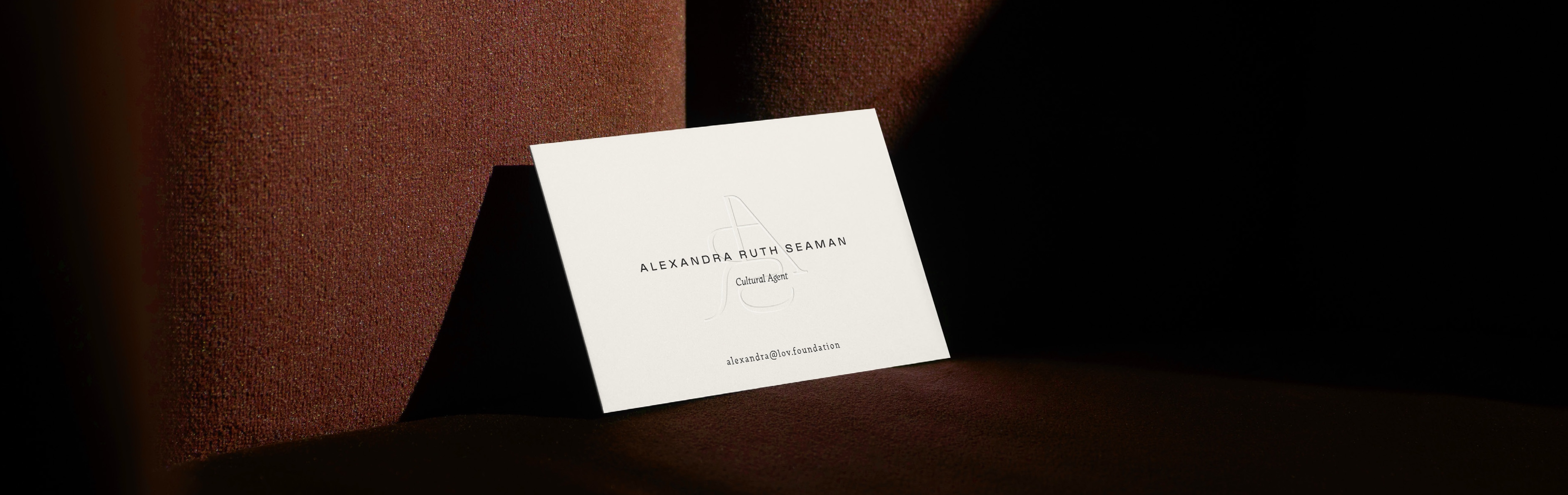
The monogram is the primary signature of the brand.
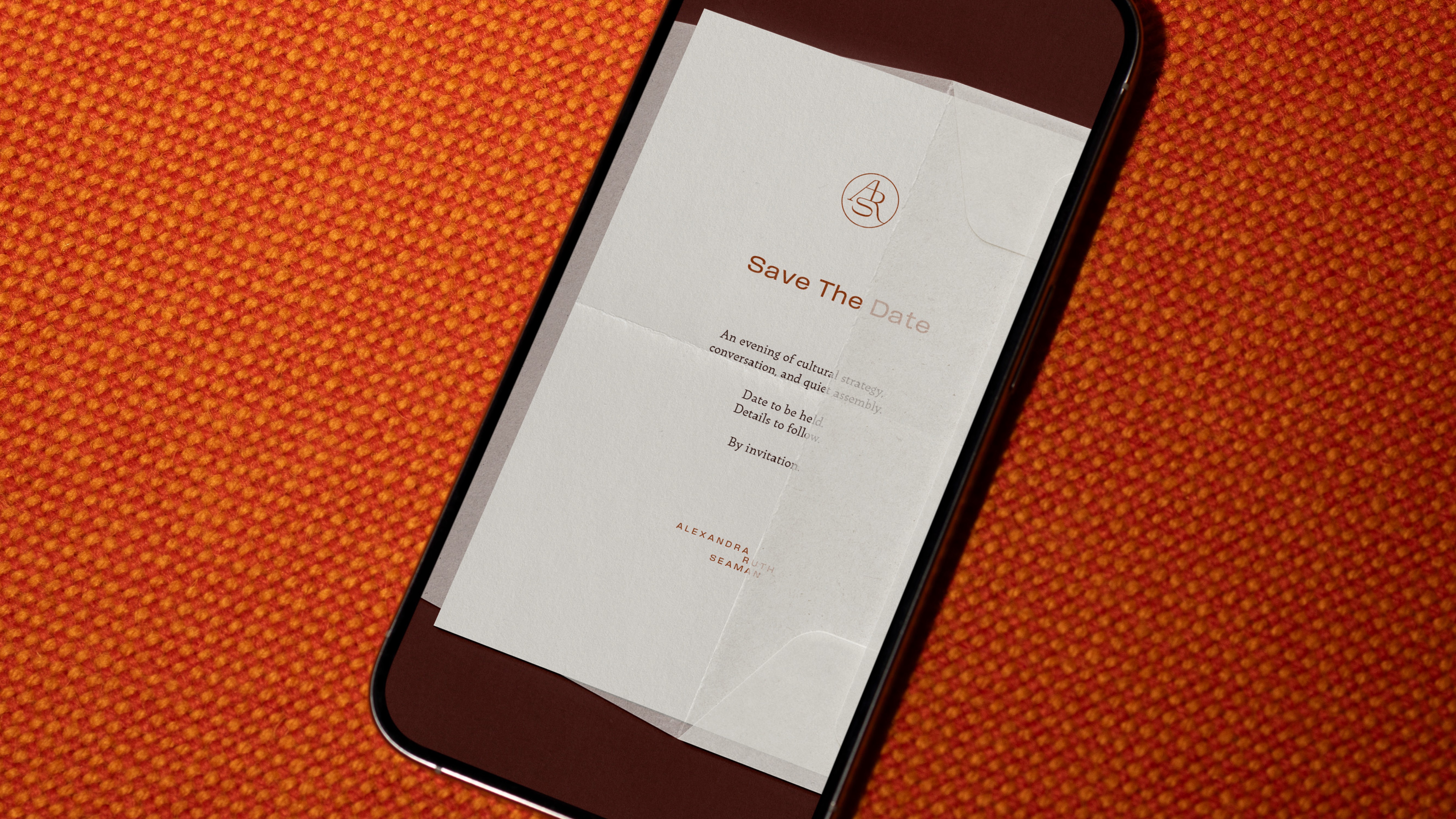
It’s designed to feel intact and calm, with a natural internal flow, so it can live quietly on a page without losing presence. The letter relationships are integrated, not assembled, which gives the mark continuity and a sense of authorship.
The monogram is built to work in two modes: Pressure-first (emboss/deboss, blind or tonal) for the most refined applications, and Ink-first (single pass) for moments that require clearer contrast.

The full name is used when clarity matters most, proposals, decks, documents, and anyfirst-touch moment where context is still forming. It’s set with restraint and generousspacing, so it reads like an attribution on an archive card, not a headline.
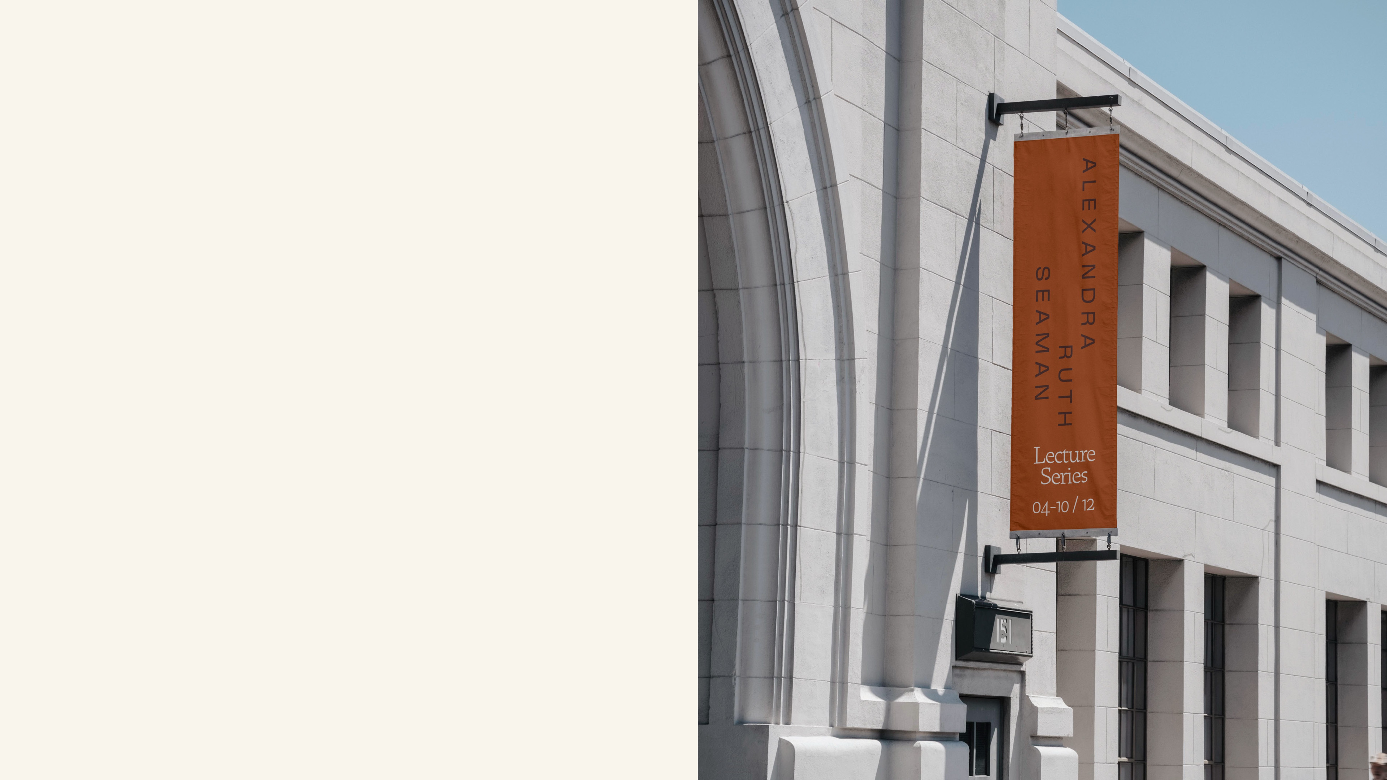
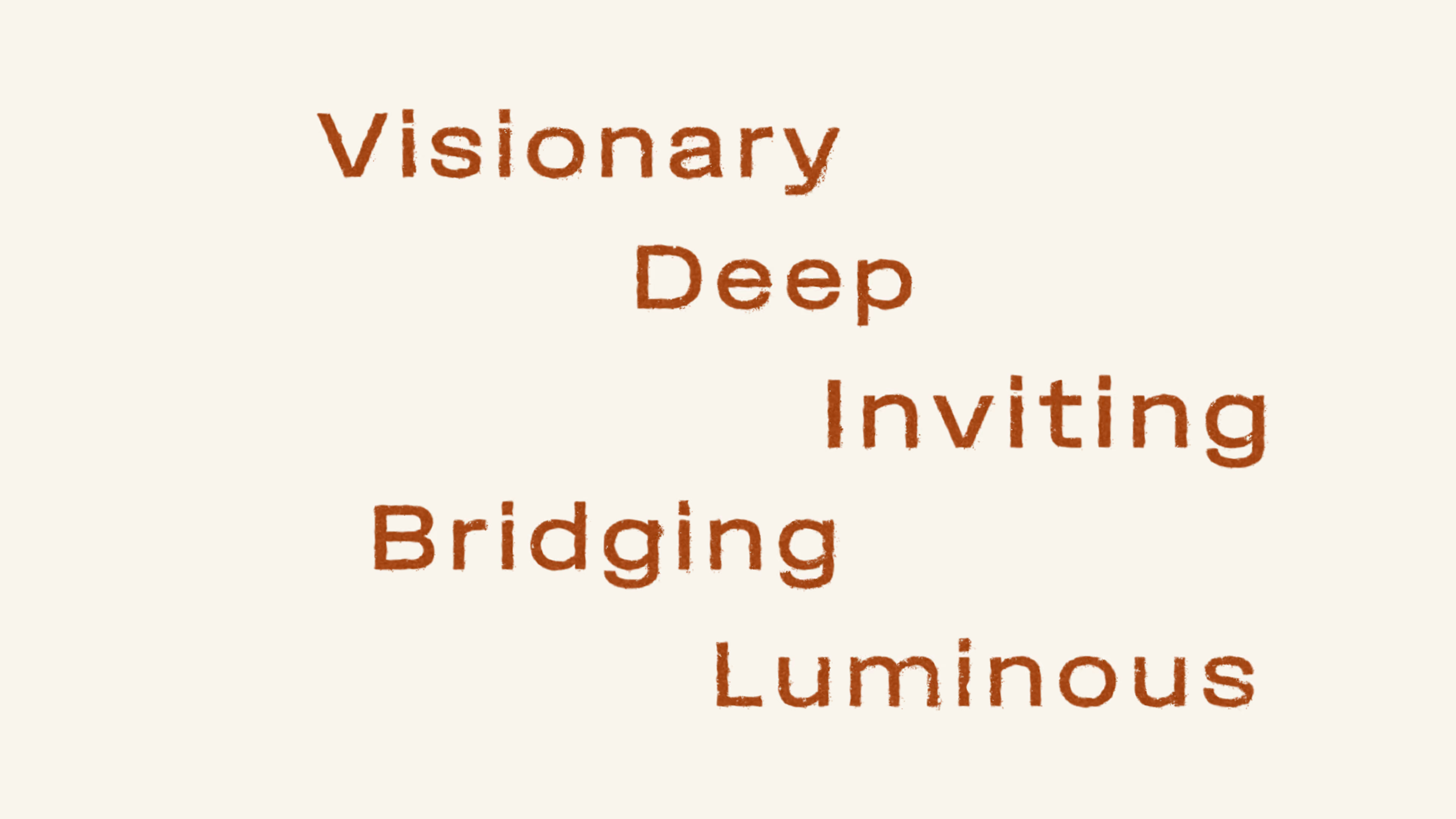
The staggered layouts introduce quiet movement and allow the name to adaptto different formats while keeping a consistent rhythm. This gives us flexibilitywithout turning the name into a graphic.
The goal is always the same: calm authority, clear hierarchy, and enough air for the brand to feel held.
The Palette
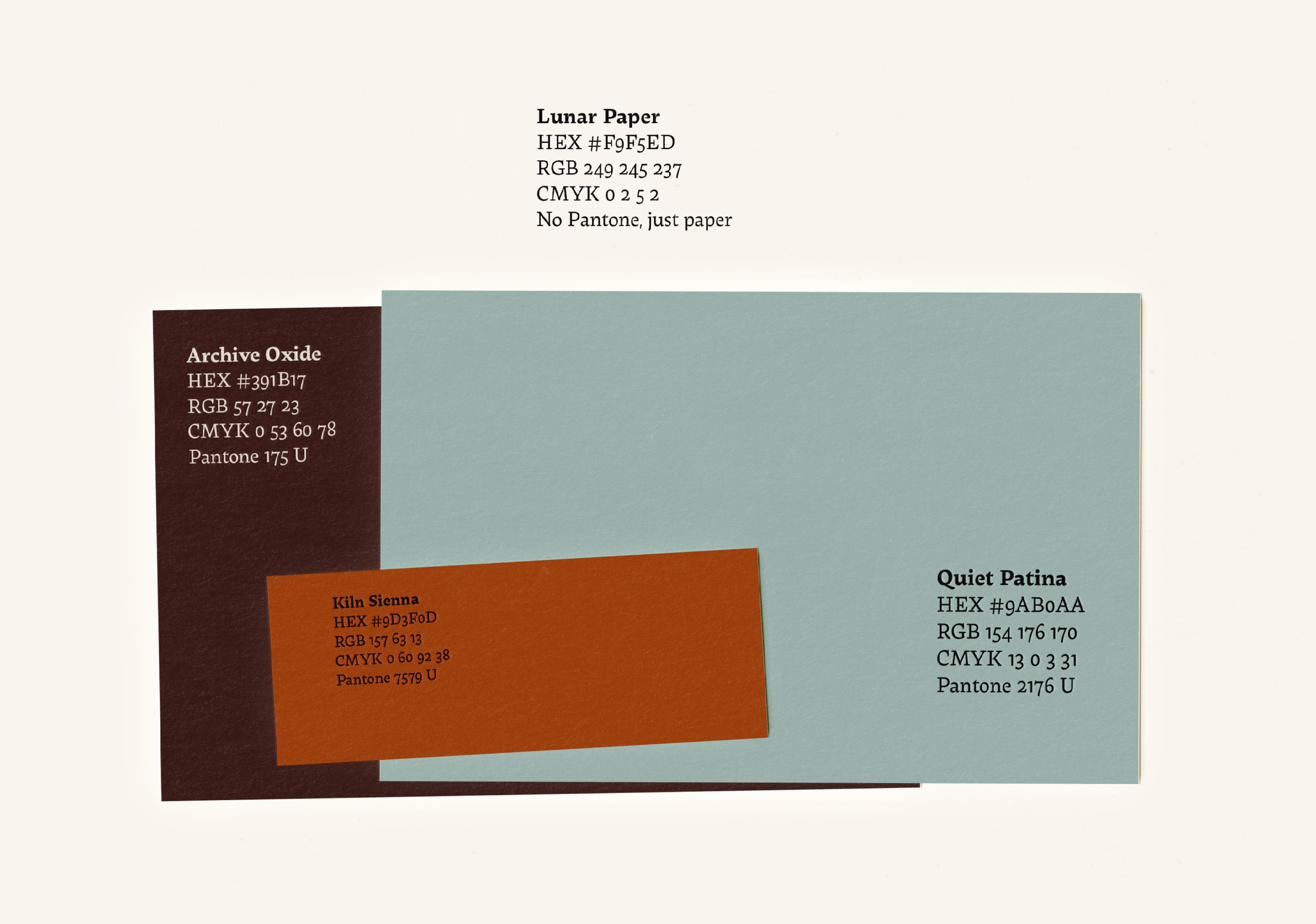
The palette is designed to feel archival and physical.
Warm paper, deep oxide, quiet patina,and a kiln-fired accent.
Most of the time, the brand lives in Lunar Paper, with colour appearing as a single, deliberate decision.
The Typography
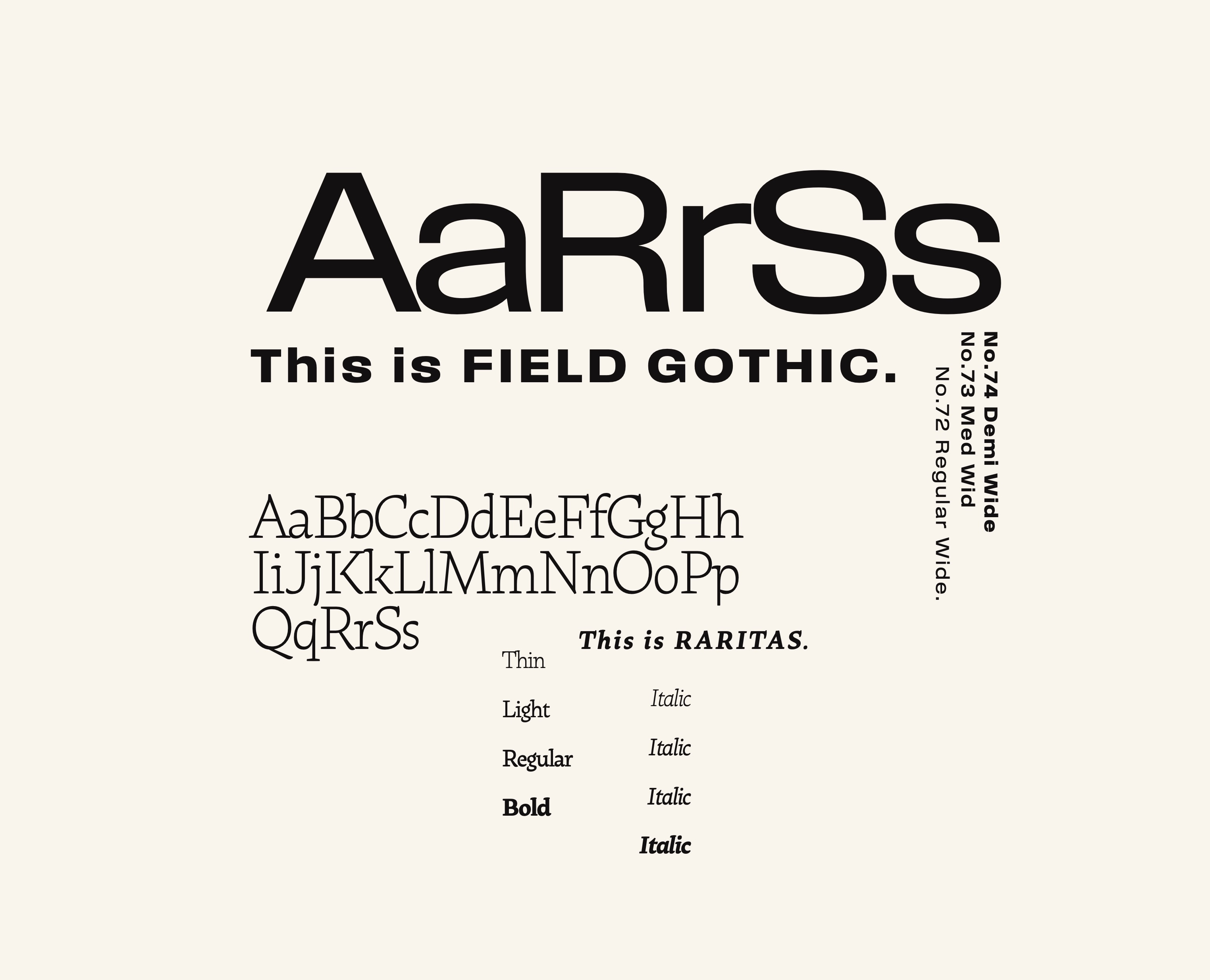
The typography carries the brand’s clarity. It is intentionally simple. It feel like a catalog page. Calm, clear, and intentional.

"Elegant in its simplest form, expressive when layered, consistent everywhere."
Materiality
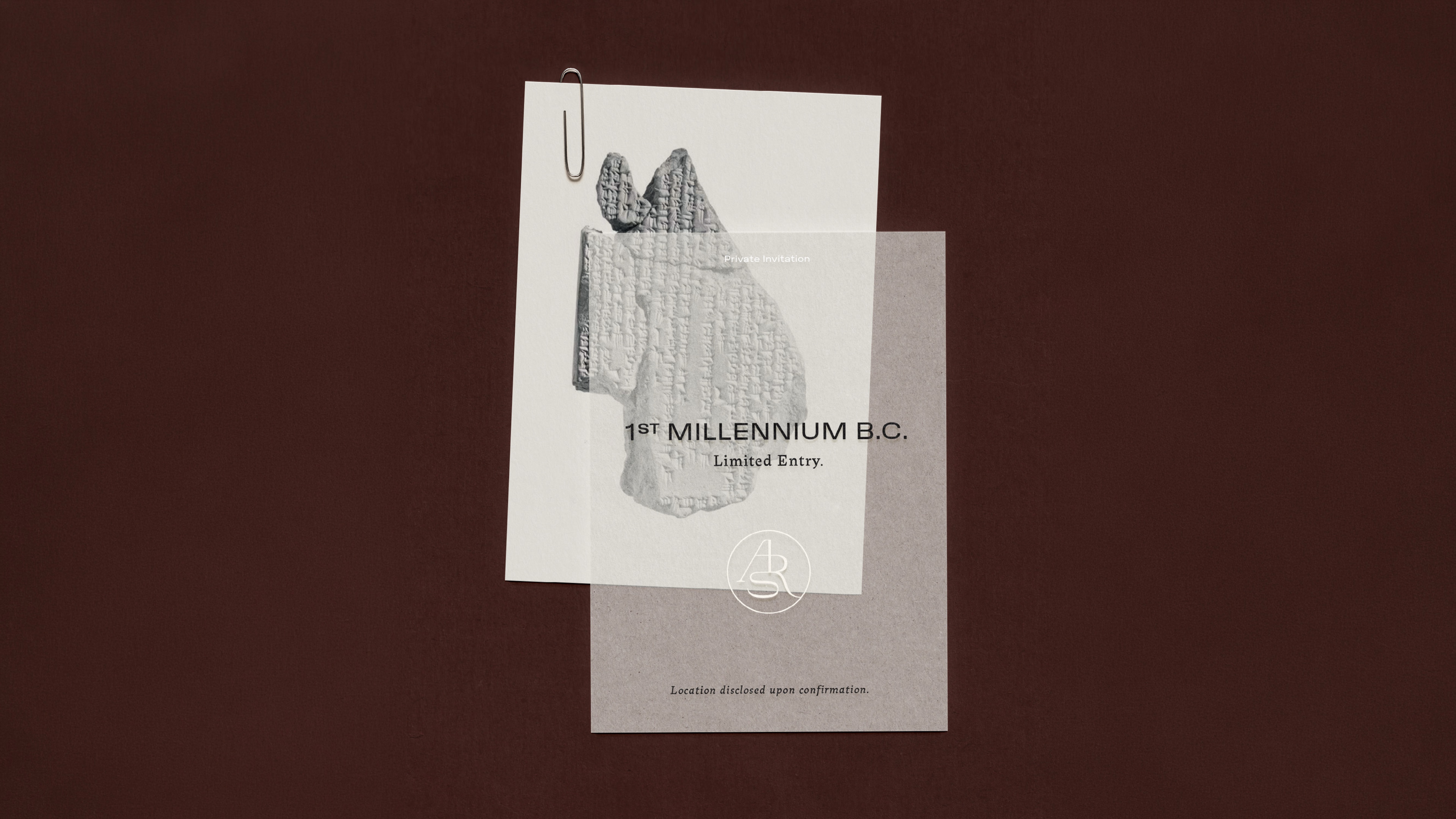
Paper is part of the identity. The brand should feel held, archived, and physical. The surface is never neutral.
Preferred materials:
Uncoated stock, visible grain, warm whites, soft fiber textures.
Occasional dyed stock (blue, rust) when it serves the mood and the message.Rule: if the paper feels glossy or synthetic, it’s not ARS.


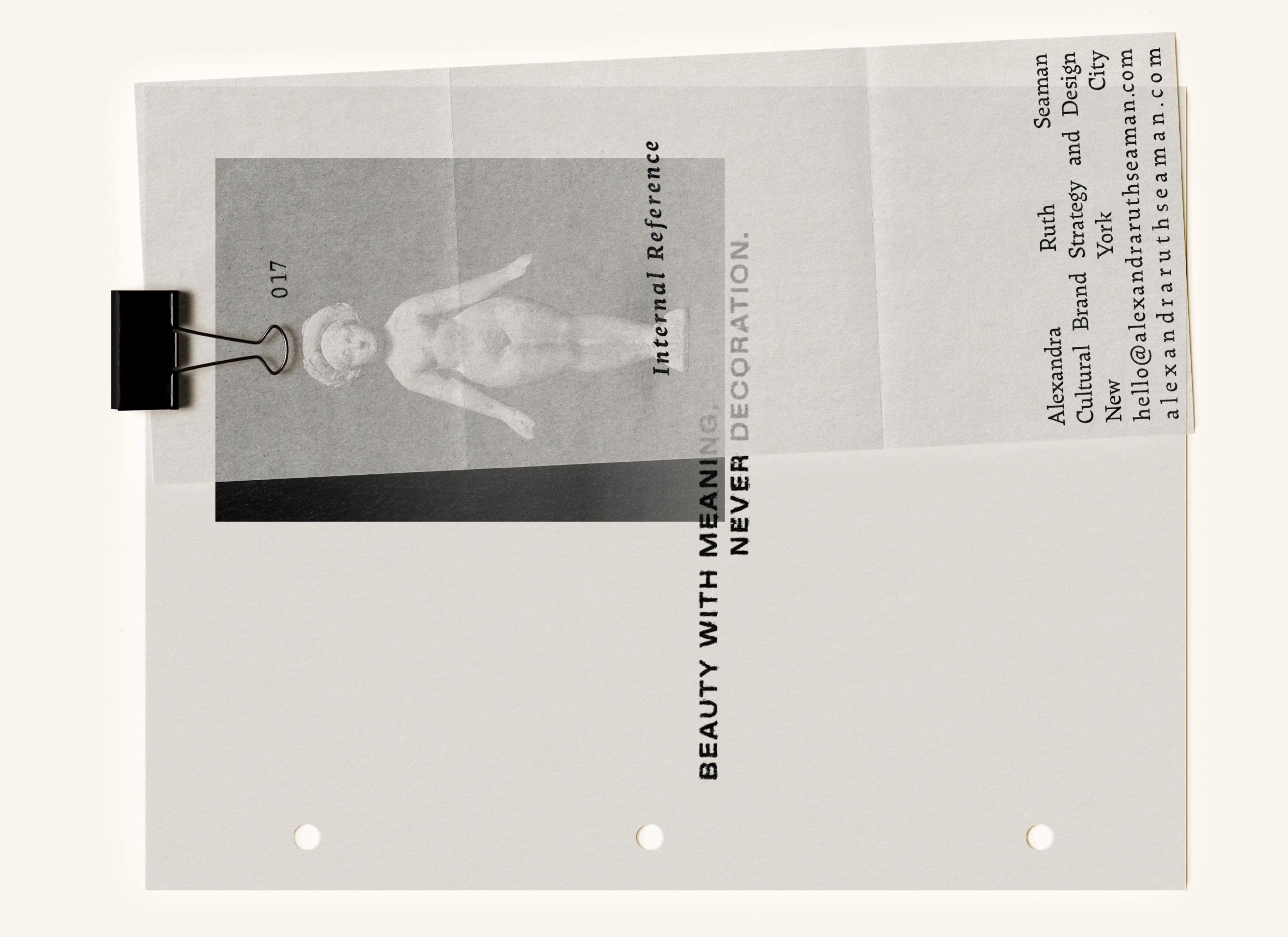
Imagery Direction
Imagery for ARS should feel like it belongs in anarchive, not a feed. Quiet, artful, and slightly aged.
Treated like documentation, not content.
The tone is museum-adjacent: still life, objects, fragments, surfaces, and close studies presented with restraint and reverence. The camera feelspatient. The mood is contemplative, intimate, and a little sacred.

"Imagery that belongs in an archive, not a feed."